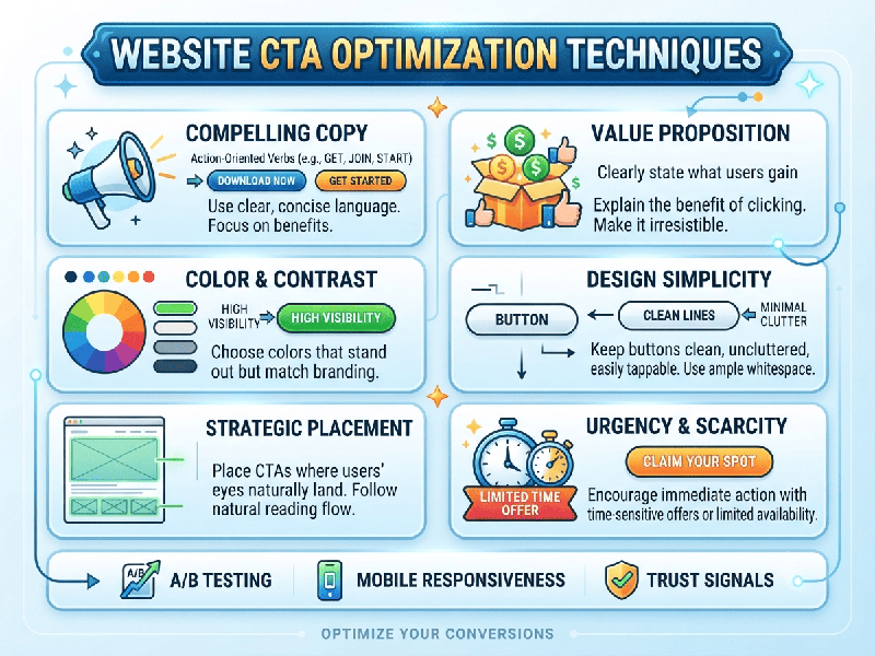
Website CTA Optimization Techniques
Overview of Website CTA Optimization
A Call to Action (CTA) is the pivotal
conversion bridge on your website—the exact moment where passive browsing turns
into active engagement, lead generation, or a completed sale. CTA
Optimization is the systematic process of refining the design, copywriting,
placement, and psychological triggers of your buttons or links to maximize
click-through and conversion rates.
Because user attention spans are brief, an optimized
CTA must instantly communicate value, reduce friction, and command visual
focus.
1. High-Converting Copywriting Strategies
Words dictate action. Generic copy like "Submit"
or "Click Here" fails because it describes an action rather
than a benefit.
- Use Action-Oriented,
First-Person Language: Shift from third-person to first-person framing to create a
psychological sense of ownership.
o Example: Change "Get your
report" to "Get My Free Report".
- Highlight Immediate Value: Reinforce what the user
receives the second they click.
o Example: "Start My 14-Day Trial"
or "Download the Checklist Instantly".
- Reduce Perceived Friction: Add microcopy directly beneath
or inside the button to alleviate hesitation.
o Example: "No credit card
required" or "Cancel anytime in 1 clicks".
2. Visual Design & Contrast Principles
If a user has to hunt for your button, they will
bounce. Your CTA must dominate the visual hierarchy of the section it occupies.
- High Color Contrast: Use an accent color for your
primary CTA button that sharply contrasts with your brand's neutral
background and secondary elements.
- Generous Whitespace: Isolate the CTA button by
surrounding it with ample negative space. Crowded elements lower click
rates.
- Size and Scale: Ensure the button is large
enough to be easily tapped on mobile devices (minimum recommended touch
target is 48x48 pixels) while remaining proportional to the desktop
layout.
3. Strategic Placement & Context
Where you place a CTA determines how warm the traffic
is when it encounters the prompt.
- Above the Fold for Simple
Conversions:
For low-friction actions (like software sign-ups, newsletter
subscriptions, or lead magnets), place a primary CTA in the hero section
where it's immediately visible without scrolling.
- Below the Fold for Complex
Offerings: For
high-ticket items or complex B2B services, users need context first. Place
your primary CTAs after you have systematically addressed pain
points, features, and social proof.
- The "Sticky" Header or
Footer CTA: For
long-form sales pages or pricing tables, keep a persistent CTA button
locked in the navigation header so it remains accessible the moment the
user makes a decision to buy.
4. Psychological Triggers & Friction Reducers
- Scarcity and Urgency: For e-commerce or limited-time
software promotions, subtly incorporate time-bound or stock-bound
language.
o Example: "Claim My Spot (Only 3
Left)".
- Social Proof Proximity: Place trust badges, customer
review ratings, or secure checkout icons immediately adjacent to the CTA
button to build instant credibility.