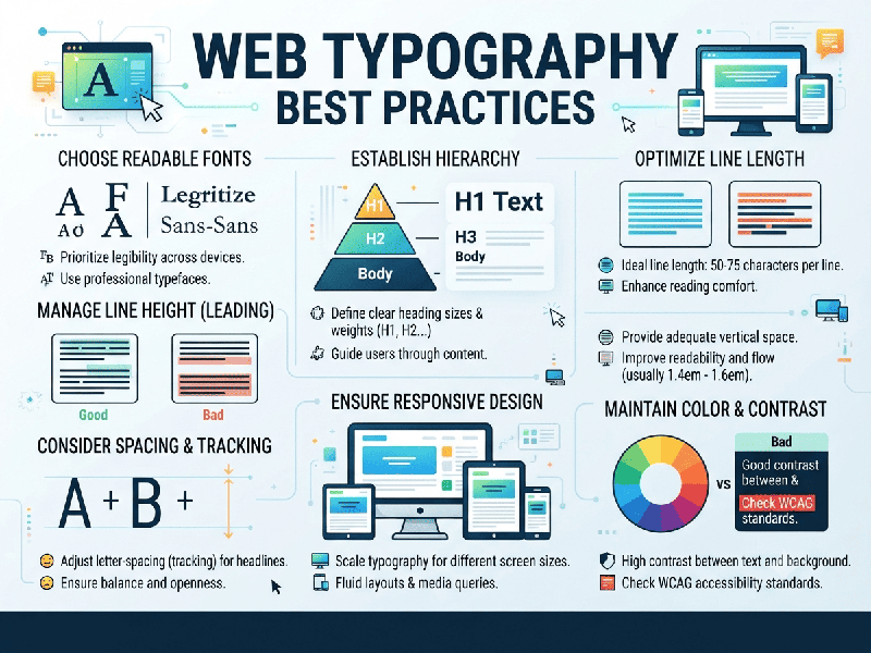
Web Typography Best Practices
Good web typography balances aesthetic appeal with high
readability, accessibility, and performance across all devices and screen
sizes. Because users scan rather than read digital content, typography must
guide the eye effortlessly.
1. Font Selection & Pairing
- Limit Your Font Families: Stick to a maximum of two
font families per site (e.g., one for headings, one for body text). Adding
more creates visual clutter and slows down page load times.
- Match Font Personality to Brand: Ensure the typeface aligns with
your brand voice (e.g., geometric sans-serifs for modern tech, traditional
serifs for editorial or luxury content).
- Prioritize System Fonts for
Performance:
While custom Google or commercial fonts are common, leveraging system font
stacks (like Inter, SF Pro, Segoe UI) eliminates layout shifts and
guarantees lightning-fast rendering.
2. Sizing & Scale (The Fluid Approach)
- Use Relative Units: Avoid fixed pixel (px) sizes
for typography. Instead, use relative units like rem for font sizes and em
for line heights/spacing to respect user browser settings and
accessibility preferences.
- Establish a Modular Scale: Use a consistent mathematical
ratio (like
- Establish a Reliable Base Size: Set your body text to a minimum
of 16px (
3. Readability & Line Metrics
The physical layout of text blocks dictates how easily
a user can consume information:
- Optimal Line Length (Measure): Keep line lengths between 45
to 75 characters (including spaces). Lines that are too long tire the
eye; lines that are too short disrupt the rhythm of reading.
- Line Height (Leading): Body text needs breathing room.
Set line heights between 1.4 and 1.6 relative to the font size.
Headings should have tighter line heights (around 1.1 to 1.2) to
prevent excessive vertical gaps.
- Paragraph Spacing: Use clear paragraph separation
(via margin-bottom of about
4. Contrast & Accessibility (WCAG Compliance)
- Color Contrast: Ensure a high contrast ratio
between text and its background.
o WCAG AA standard: At least 4.5:1 for normal
body text and 3:1 for large text (18pt+ or 14pt bold).
o WCAG AAA standard: Aim for 7:1 when possible for
maximum accessibility.
- Avoid Pure Black on Pure White: #000000 text on #FFFFFF
background can cause eye strain due to extreme contrast. Instead, use dark
charcoal (e.g., #111111 or #222222) on off-white or soft-gray backgrounds.
5. Performance & Technical Optimization
- Font-Display Property: Use font-display: swap; in your
CSS @font-face rules. This tells the browser to display fallback system
text immediately while the custom font loads, preventing invisible text
flashes (FOIT).
- Subset Your Fonts: If using custom fonts, download
only the character sets you need (e.g., Latin-only) to dramatically reduce
file sizes.
- Modern Formats: Serve fonts in modern, highly
compressed formats like WOFF2 rather than older TTF or EOT files.