Web Layout Modern Patterns
Modern web
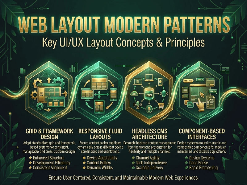
design has moved far beyond simple grids. Today, layouts are driven by responsiveness,
user intent, and content hierarchy. Here are the most influential modern
layout patterns currently shaping the web:
1. The
Bento Box Grid
Inspired by
Apple’s promotional materials and dashboard designs, this layout organizes
content into rectangular cells of varying sizes. It’s perfect for summarizing
features or displaying a portfolio.
- Why it works: It creates a high-density
information display that feels organized rather than cluttered.
- Best for: Dashboards, feature sections,
and personal portfolios.
2. The
Bento-Masonry Hybrid
While
traditional Masonry (think Pinterest) uses fixed-width columns with varying
heights, the modern hybrid approach uses CSS Grid to create
"staggered" looks that still align to a strict rhythmic grid.
3.
Dynamic "Bento-Style" Bento
This isn't
just a static grid; it uses container queries to change the internal
layout of each "box" based on its own size, not just the viewport
size.
4. The
Hero Split (Asymmetrical)
The
"split screen" is a classic, but the modern version is often asymmetrical.
One side might hold a high-quality visual, while the other holds a minimalist
call-to-action (CTA).
- The Twist: Often, elements from one side
will "bleed" into the other to create depth and a sense of
motion.
5. Sticky
Stacked Sections
In this
pattern, as the user scrolls, the previous section stays "stuck" to
the top, and the new section slides over it like a deck of cards.
- Benefit: It keeps the user focused on
one specific message at a time while providing a tactile, high-end feel.