Visual Hierarchy in Website Design
Visual hierarchy is the strategic arrangement and presentation of
website elements in an order of importance, guiding the user’s eye naturally
from the most critical information down to secondary details and
calls-to-action (CTAs).
When executed correctly, visual hierarchy creates an
intuitive user journey, reduces cognitive load, and drives higher conversion
rates.
Core Principles of Visual Hierarchy
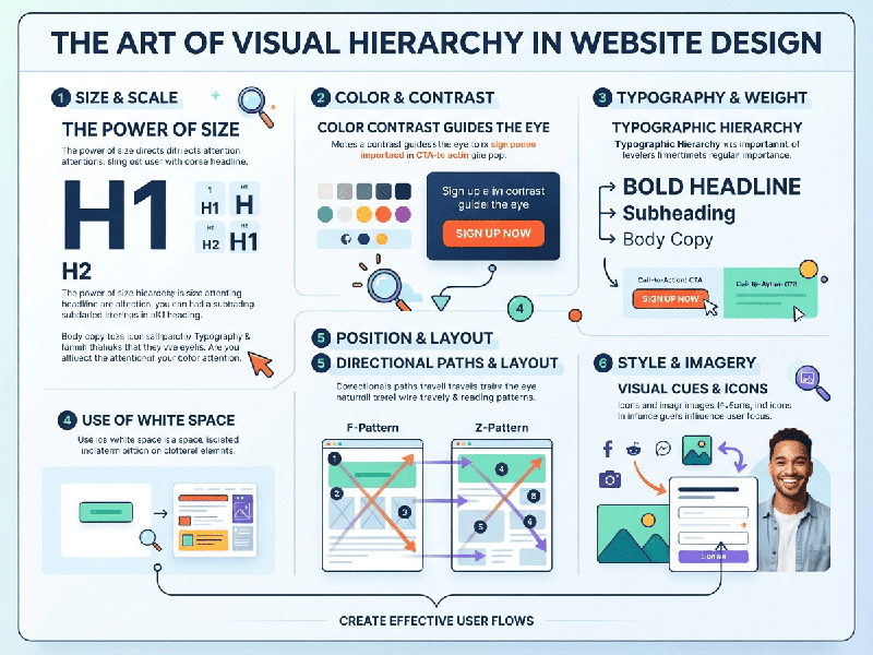
- Size and Scale: The human eye naturally
gravitates toward larger elements first. Primary headlines, hero images,
and main CTAs should command the largest visual footprint.
- Typography and Weight: Varying font sizes, weights
(bold vs. regular), and styles (serif vs. sans-serif) establish clear
reading tiers (e.g., H1 headings vs. body text).
- Color and Contrast: Strategic use of color draws
immediate focus. A high-contrast accent color applied sparingly to a
button or warning banner makes it stand out against a neutral background.
- Whitespace (Negative Space): Leaving empty space around an
element isolates it, giving it more visual breathing room and making it
appear more important.
- Proximity and Grouping: Elements that are close
together are perceived as related. Grouping forms, input fields, or
pricing features together helps users process information in chunks.
- Reading Patterns (F-Shaped and
Z-Shaped):
o F-Pattern: Common on text-heavy pages (blogs,
articles); users scan horizontally across the top, down the left side, and
progressively shorter horizontal sweeps.
o Z-Pattern: Common on landing pages and
minimalist sites; the eye moves from top-left to top-right, diagonally down to
the bottom-left, and across to the bottom-right.
The 4-Tier Hierarchy Structure
A well-structured web page typically organizes content
into four distinct visual tiers:
1.
The Hook (Level 1): The absolute first thing the user sees. Includes the primary value
proposition (H1), hero graphic, and the main conversion action (e.g.,
"Start Free Trial").
2.
The Support (Level 2): Subheadings (H2) and supporting imagery that validate the
hook, explain how the product or service works, and provide context.
3.
The Detail (Level 3): Body text, feature lists, pricing breakdowns, and secondary links that
allow interested users to dive deeper.
4.
The Footer / Sign-off (Level 4): Legal links, copyright notices, secondary navigation, and
social proof icons.
Best Practices for Implementation
- Limit Accent Colors: Stick to one or two accent
colors for interactive elements (like buttons). If everything is
highlighted, nothing stands out.
- Establish a Strict Type Scale: Use a design system with fixed
font sizes and line heights to maintain consistency across all pages.
- Test with the "5-Second
Test":
Show your landing page to a user for five seconds, then hide it. If they
cannot tell you what the site is about and what action they are supposed
to take, your visual hierarchy needs adjustment.