Responsive Layout Techniques for 2026
Responsive web design has moved beyond simple viewport-based
breakpoints. The modern landscape prioritizes component-level modularity,
AI-assisted adaptability, and performance-first engineering.
1. The Core Technical Shift: Component-Aware Design
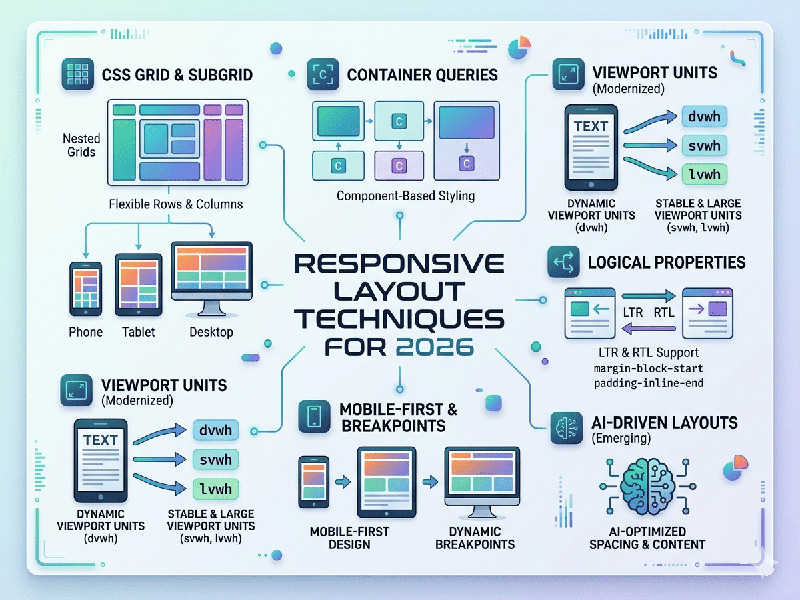
The most significant evolution is the move away from global
media queries toward Container Queries.
- Why it matters: Instead of relying on the
browser's width (which can be unpredictable in multi-window or sidebar
scenarios), components now "know" the size of their parent
container. This allows a card, sidebar, or data table to reconfigure
itself intelligently based on its specific context, not just the device's
screen size.
- Implementation: Using @container rules, you can
define how a component behaves (e.g., switching from a horizontal layout
to a stacked vertical stack) the moment its parent container hits a
specific threshold.
2. Fluidity without Breakpoints
Developers are increasingly using native CSS features to
create "liquid" layouts that require fewer (or no) breakpoints.
- Fluid Typography: The clamp() function has become
the gold standard. By setting a minimum, preferred, and maximum value
(e.g., font-size: clamp(1rem, 2vw + 0.5rem, 3rem);), text scales naturally
as the viewport changes, maintaining perfect readability without
"jumping" at traditional breakpoints.
- Relative Units: Relying on rem, em, and fr
(fractional units in CSS Grid) ensures that elements scale proportionally
to their environment rather than being locked to fixed pixel widths.
3. Modern CSS for "Zero-JS" Layouts
Newer CSS features are replacing complex JavaScript libraries
previously needed for advanced layouts:
- :has() Selector: The "parent selector"
allows you to style a container based on its children (e.g., changing a
layout's padding if a specific image element is present).
- Masonry Layouts (Grid Lanes): Native support for
waterfall-style layouts is replacing heavy third-party scripts.
- Scroll-Driven Animations: Animations can now be tied to
scroll progress natively, creating highly responsive, performant
interactive layouts without the performance overhead of JS scroll
listeners.
4. Performance & The "Smart" Web
In 2026, responsiveness is intrinsically tied to Web
Vitals. A layout is not considered responsive if it is slow.
- Adaptive Content: AI is increasingly used to
deliver personalized layouts or image sizes in real-time, serving
high-resolution assets only to devices capable of displaying them quickly,
while prioritizing light-weight versions for constrained network
conditions.
- CSS Containment: Using container-type:
inline-size helps browsers optimize rendering performance by isolating
parts of the DOM, ensuring that an update in one area of the page doesn't
trigger a reflow of the entire layout.
5. Best Practices Checklist (2026)
- Mobile-First Foundation: Build for the most constrained
environment first; scale complexity up, not down.
- Touch-Friendly Targets: Ensure all interactive elements
meet modern accessibility standards (at least 48x48 pixels) to accommodate
diverse devices, including wearables and touch-displays.
- Semantic HTML + CSS: Minimize reliance on JavaScript
for core layout logic. Native browser features are faster, more
accessible, and more maintainable.
- Progressive Disclosure: Use patterns like accordions or
navigation drawers to hide secondary content on smaller screens, keeping
the primary user journey clutter-free.