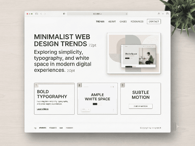
Minimalist Web Design Trends
Minimalist web design in 2026 has moved beyond simple
"empty space" to become a more nuanced, purposeful strategy. While
the core principle of "less is more" remains, modern minimalism now
integrates interactivity and personality to create more engaging user
experiences.
Core Trends in Minimalist Design for 2026
- Typography-First Design: Oversized, bold, and highly
legible fonts have become the primary visual element, often replacing
heavy imagery. This approach creates a strong visual hierarchy that
communicates brand messages instantly.
- Purposeful Interactivity: Static minimalism is evolving.
Subtle micro-interactions—such as hover effects, button morphs, and smooth
scroll-triggered animations—guide the user and provide feedback without
cluttering the interface.
- Refined Use of Motion: Animations are now
"functional," meaning they are used to support navigation or
storytelling rather than for purely decorative "flashy" effects.
- Sustainability-Driven Layouts: Minimalism is being used as a
tool for "green" web design. By keeping code lightweight,
minimizing HTTP requests, and optimizing imagery, designers are creating
sites that are both fast and eco-friendly.
- "Resonant Stark" &
Neo-Minimalism:
A prominent 2026 aesthetic that uses ultra-thin fonts, soft gradients, and
ample negative space to create a calm, elegant atmosphere. It is designed
to be "quiet" but confident, using simplicity as a tool for
storytelling.
- Strategic Use of Color: High-end minimalist designs
often limit palettes to 2–3 primary tones. Contrast is used to create
depth and focus rather than relying on diverse color variations.
Why Minimalism Remains a Priority
- Performance (SEO): Minimalist sites have fewer DOM
elements and smaller CSS bundles, leading to faster load times which are
critical for Google’s Core Web Vitals rankings.
- Reduced Cognitive Load: By eliminating non-essential
elements, brands can help users focus on the primary call-to-action or
core message, which is essential in an era of digital information
overload.
- Mobile-First Adaptability: Minimalism is inherently suited
for mobile, where screen real estate is limited and performance is
paramount.
Practical Implementation Tips
- Evaluate Every Element: Before adding a feature, ask if
it serves a distinct purpose or tells a story. If it acts as
"filler," it is likely harming your minimalist intent.
- Prioritize Accessibility: Ensure that your color contrast
remains high (especially when using thin fonts) and that your dark mode
implementation is legible and comfortable.
- Use Negative Space Confidently: Don't fear the
"empty" space; use it to draw the user’s eye exactly where you
want them to look.