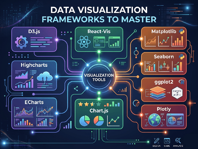
Data Visualization Frameworks to Master
Data visualization has moved far beyond simple bar charts and
static line graphs. In today's data-driven landscape, mastering the right
visualization frameworks means knowing how to balance raw performance,
pixel-perfect design customizability, and ease of development.
The framework you choose depends entirely on your stack, your
audience, and whether you are building exploratory analytical tools or highly
tailored, interactive web experiences.
The Landscape: Choosing by Ecosystem
The data visualization world is generally split into two major methodologies: Web/JavaScript Libraries for bespoke interactive client-facing applications, and Data Science/Backend Frameworks (largely Python and R) for fast exploration, machine learning insights, and dashboarding.
1. Web & JavaScript Frameworks (Bespoke &
Interactive)
D3.js (Data-Driven Documents)
D3.js remains the gold standard for creating entirely custom,
complex web visualizations. Rather than giving you pre-packaged charts, D3 acts
as a low-level tool that lets you bind arbitrary data directly to the web
page's Document Object Model (DOM) and manipulate vector graphics (SVG) or
canvas elements with pixel-perfect control.
- Best For: Bespoke interactive
infographics, complex network graphs, custom geographic maps, and unique
data layouts that standard charting libraries do not support.
- The Learning Curve: Steep. You must manage your own
math, scales, axis rendering, and transitions from scratch.
Chart.js & ECharts
If you do not need D3's extreme level of customization and
just want clean, responsive, out-of-the-box charts that look beautiful on
mobile and desktop, high-level libraries are the answer.
- Chart.js: A lightweight, HTML5
canvas-based library. It is incredibly simple to implement for standard
dashboards requiring clean bar, line, pie, and radar charts with native
animations.
- Apache ECharts: A powerful, enterprise-grade
declarative framework capable of rendering massive datasets smoothly using
canvas or WebGL. It handles complex multi-axis charts, heatmaps, and
flight-path maps right out of the box.
2. Python & Data Science Frameworks (Analytical &
Operational)
Plotly & Dash
Plotly bridges the gap between data science and interactive
web apps. Written in Python (but built on top of plotly.js), it allows you to
generate highly interactive charts with hover labels, zoom-to-window
capabilities, and dynamic filtering using just a few lines of clean backend
code.
- Dash: Plotly’s companion framework.
It lets you build complete, reactive web applications and analytical
dashboards entirely in Python without writing HTML, CSS, or JavaScript.
- Best For: Financial modeling, supply
chain tracing, cloud cost dashboards, and giving non-technical
stakeholders deep drill-down access to complex datasets.