Conversion Optimization Using Heatmap Tools
Website conversion rates rarely improve by guesswork. When
visitors land on a page but leave without converting, a heatmap tool acts like
an X-ray, showing exactly where they click, how far they scroll, and what they
completely ignore.
By visualizing user behavior, heatmaps transform abstract
analytics into clear, actionable design fixes.
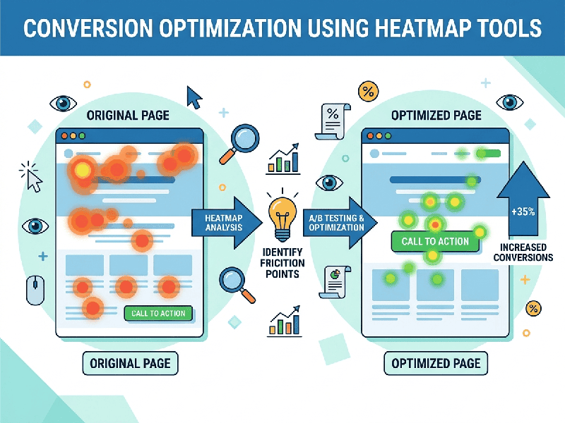
Driving Conversions with Heatmaps
A heatmap aggregates user interactions into a color-coded
visual overlay, where "hot" red zones indicate high activity and
"cool" blue zones show neglect. To optimize conversions, businesses
primarily look at three specific data overlays: click maps (where users
tap or click), scroll maps (how far down they scroll), and move maps
(where they hover their mouse).
Instead of guessing why a page is underperforming, these
tools highlight specific friction points that are killing sales.
Actionable Strategies for Higher Conversions
- Fixing Dead Clicks: Click maps often reveal users
repeatedly tapping non-clickable elements, like a static product image or
an unlinked headline. This signals frustration. Converting those elements
into actual links satisfies user intent and keeps them moving down the
funnel.
- Optimizing CTA Placement: Scroll maps show the exact
percentage of visitors who see different sections of a page. If your
primary Call-to-Action (CTA) button is placed below the point where 60% of
your audience stops scrolling, it is effectively invisible. Moving the CTA
higher up (above the fold) or using a sticky navigation bar ensures every
user sees it.
- Eliminating Distractions: If a move map or click map
shows users focusing heavily on a non-essential image or banner rather
than your primary signup form, that element is a distraction. Removing or
downplaying secondary elements channels user attention back toward the
main conversion goal.
- Streamlining Forms: Hover and attention maps can
pinpoint the exact form fields where users hesitate or abandon the page
entirely. If users stall at a required "Phone Number" field,
removing that field can instantly boost form completions.