Website Style Guide Creation
A website style guide is a living document that ensures
visual and functional consistency across your entire digital presence. It
serves as the single source of truth for designers, developers, and content
creators.
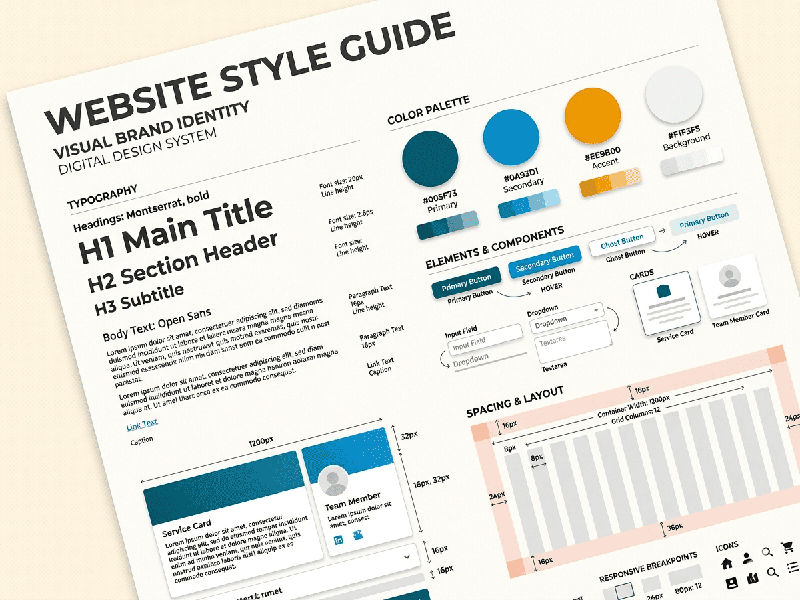
1. Core Visual Elements
These are the foundational blocks that define the
"look" of your site.
A. Typography
Establish a clear hierarchy to ensure readability and
scan-ability.
- Typefaces: Define your primary (headings)
and secondary (body) fonts.
- Scale: Set specific sizes, line
heights, and weights for $H1$ through $H6$ and Paragraph text.
- Web-Safe Backups: Always list a fallback font
(e.g., Arial or Helvetica) in case the custom font fails to load.
B. Color Palette
Use a structured approach to color to maintain brand
integrity.
- Primary Colors: The dominant colors used for
logos and key branding.
- Secondary/Accent Colors: Used for highlights and
call-to-action (CTA) buttons.
- Neutral Tones: Grays, whites, and blacks used
for backgrounds and borders.
- Functional Colors: Specific shades for
"Success" (green), "Error" (red), and
"Warning" (yellow).
C. Imagery and Iconography
Define the "vibe" of your visuals.
- Photography Style: Should images be candid,
professional, or minimalist? Specify filters or framing.
- Icon Sets: Use a consistent line weight
and style (e.g., outlined vs. solid) across all icons.
2. Interface Components (UI Kit)
This section defines how interactive elements behave.
Consistency here reduces "cognitive load" for the user.
- Buttons: Define states for Normal,
Hover, Active (Clicked), and Disabled.
- Form Fields: Design for text inputs,
checkboxes, and radio buttons, including error validation states.
- Navigation: Standardize the header, footer,
and breadcrumb styles.
- Cards and Containers: Define the border-radius
(rounded corners), drop shadows, and padding for content blocks.
3. Layout and Spacing
A style guide must dictate the "skeleton" of the
site.
- The Grid System: Specify if you are using a
12-column grid or a flexbox-based layout.
- Spacing Scale: Instead of random pixel values,
use a mathematical scale (e.g., multiples of 8px) for margins and
padding to ensure mathematical harmony.
- Breakpoints: Define exactly when the layout
shifts for Mobile, Tablet, and Desktop screens.
4. Tone and Voice
A style guide isn't just visual; it’s also about how the
website "speaks."
- Grammar Rules: (e.g., Title Case vs. Sentence
Case for headings).
- Point of View: Are you using "We/Us"
(First person) or "The Company" (Third person)?
- Call-to-Action Style: Is the language urgent
("Buy Now!") or inviting ("Explore our collection")?
5. Implementation Tools
To make the guide useful, host it where the team can access
it:
- Figma/Adobe XD: For visual libraries and CSS
handoff.
- Storybook: For developers to view live,
interactive code components.
- Zeroheight: A dedicated platform to sync
design tokens and documentation.