Typography in Web Design
Typography is the silent ambassador of web design. It is not
just about choosing a font; it is about establishing a visual hierarchy,
ensuring legibility, and influencing how a user perceives a brand's authority
and personality.
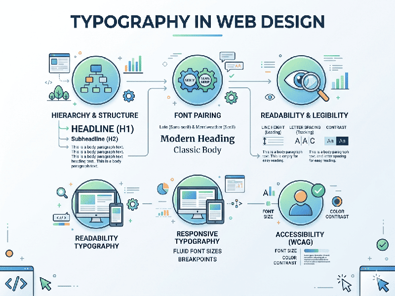
1. Visual Hierarchy and Scale
Hierarchy guides the user’s eye to the most important
information first.
- The Golden Ratio: Many designers use a
typographic scale (e.g., $1:1.25$ or $1:1.618$) to determine the size
difference between headers ($H1, H2, H3$) and body text.
- Contrast: Use weight (Bold vs. Regular)
and color (Dark Gray vs. Light Gray) to distinguish between a headline and
a caption.
2. Legibility and Readability
While "legibility" refers to how easy it is to
distinguish one letter from another, "readability" is how easily a
user can scan a full block of text.
- Line Length (Measure): The ideal line length for body
text is 45 to 75 characters. Anything longer tires the eyes;
anything shorter breaks the reader's rhythm.
- Line Height (Leading): For web text, a line height of 1.5
to 1.6 times the font size is the sweet spot for comfortable reading.
- Letter Spacing (Tracking): Increase tracking slightly for
all-caps headers to improve clarity, but keep body text at its default
setting.
3. Font Selection: Serif vs. Sans Serif
- Sans Serif (e.g., Inter, Roboto,
Montserrat):
The standard for web design. They look clean and modern, and they scale
well on low-resolution screens.
- Serif (e.g., Playfair Display,
Merriweather, Lora): Often used for long-form editorial content or luxury brands. Modern
high-DPI screens (Retina displays) have made serifs much easier to read
than they were in the early web era.
- The "Pairing" Rule: Limit yourself to two
typefaces. Use a distinctive "display" font for headers and
a highly legible "workhorse" font for body copy.
4. Responsive Typography
Typography must adapt to the screen it is on.
- Fluid Type: Instead of fixed pixels (px),
use relative units like rem, em, or viewport units (vw).
- The 16px Base: Generally, 16px is the
minimum recommended size for body text on desktop to ensure accessibility.
For mobile, you may increase this slightly or adjust the line height to
compensate for the smaller viewport.
5. Web Accessibility (WCAG)
- Color Contrast: Ensure a contrast ratio of at
least 4.5:1 for body text against its background to assist users
with visual impairments.
- Avoid Justified Text: On the web,
"justified" alignment creates irregular gaps (rivers) between
words, which makes it difficult for people with dyslexia to read. Stick to
Left Aligned text.