Image Optimization Techniques for Faster Websites
Slow websites are the ultimate vibe-killer for user
experience and SEO. Since images usually account for the bulk of a webpage's
weight, optimizing them is the highest-leverage move you can make for
performance.
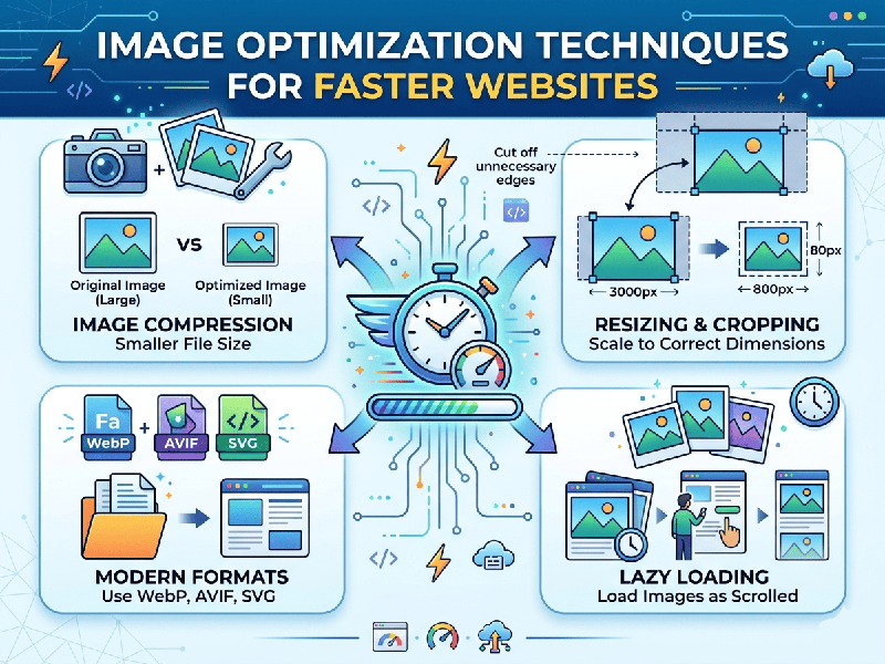
1. Choose the Right File Format
Selecting the correct format can reduce file size by over 50%
before you even start compressing.
- WebP: The current gold standard. It
provides superior lossless and lossy compression compared to JPEG and PNG.
- AVIF: Even more efficient than WebP,
though slightly less supported by older browsers.
- SVG: Best for icons, logos, and
simple illustrations. Because they are code-based (XML), they scale
infinitely without pixelation and have tiny file sizes.
- JPEG: Use only if WebP isn't an
option for high-detail photography.
2. Implement "Lazy Loading"
Lazy loading ensures that images are only downloaded when
they are about to enter the user's viewport (as they scroll down).
- How to do it: Add the
loading="lazy" attribute to your <img> tags.
- Result: Faster initial page load and
saved data for users who don't scroll to the bottom.
3. Responsive Images (Srcset)
Don't serve a massive $4000 \times 3000$ pixel image to a
smartphone user with a small screen. It wastes bandwidth and forces the mobile
processor to work harder to downscale it.
Use the srcset attribute to provide a list of different image
sizes, allowing the browser to pick the one that best fits the device.
4. Efficient Compression
Compression reduces the file size by removing unnecessary
metadata and subtly simplifying color data.
- Lossy Compression: Removes some data to
significantly shrink the file (best for WebP/JPEG).
- Lossless Compression: Shakes out unnecessary
"bloat" without changing a single pixel (best for PNG).
- Tools: Use automated tools like TinyPNG,
ImageOptim, or build-in plugins for Webpack/Vite.
5. Use Content Delivery Networks (Image CDNs)
An Image CDN (like Cloudinary or Imgix) acts as a smart
middleman. When a user requests an image, the CDN:
1.
Detects
the user's device and browser.
2.
Resizes
and converts the image on the fly.
3. Delivers the optimized file from a server physically close to the user.