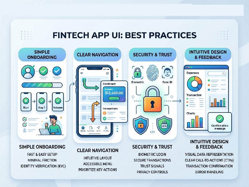
FinTech App UI Best Practices
In financial technology, user interface (UI) design
directly dictates a user's sense of financial security and operational clarity.
In 2026, FinTech UI has evolved from purely "minimalist aesthetic"
dashboards into hyper-personalized, high-assurance platforms where trust is
built through interaction design, clear data hierarchy, and intentional
friction.
1. Data Density Over Aggressive Simplification
A common mistake in mobile design is hiding critical
financial information behind "friendly, clean" menus to avoid
overwhelming the user. However, financial users prioritize instant access to
their metrics over aesthetic spacing.
- The Principle of Legibility: Every pixel must earn its
place. Use structured data tables, contextually grouped cards, and clear
typography weights so balances, transaction states, and performance
metrics are readable at a glance.
- Direct Labeling: Avoid making users guess what a
chart represents. Place labels, dates, and currency symbols (e.g., ₹ for
Indian localized markets) directly on data visualizations rather than
burying them in legends or tooltips.
2. Strategic Color Architecture
In standard applications, color is often decorative.
In FinTech, color carries psychological weight and can trigger immediate user
anxiety or reassurance.
- Functional Meaning: Reserve bold color indicators
(like red and green) strictly for signaling status, market direction, or
system health. Do not use them as primary branding elements.
- Calm Foundations: Use a neutral background canvas
(supporting both Light Mode and a well-optimized Dark Mode default) to
give data elements maximum contrast and readability.
- Color-Independent Design: Never rely on color alone to
convey critical monetary states. Always pair a red/green indicator with an
explicit icon (arrow up/down) or text descriptor to ensure accessibility
for colorblind or neurodivergent users.
3. Intentional Friction as a Feature
While modern UI aims to eliminate friction entirely,
high-stakes financial interactions require the exact opposite. Strategic
slowing down builds trust.
- High-Stakes Checkpoints: Introduce clear modal sheets,
confirmation timers, or long-press "Slide to Approve" gestures
for final money transfers, large loan applications, or account changes.
This reassures the user that the system is treating their capital with
appropriate caution.
- Zero-Friction Maintenance: Keep daily routine tasks like
biometric login, balance checks, and transaction filtering completely
frictionless, moving security checkpoints completely to the background
using behavioral AI.
4. Interactive Components & Micro-Feedback
Because money in an app is abstract, the interface
must provide tactile reassurance that actions have successfully registered.
- Haptic and Visual Synergy: Pair every critical transaction
state with clear haptic feedback (light pulses for selections, distinct
double-pulses for successful payments) alongside smooth micro-animations.
- Transparent Waiting States: If a blockchain verification or
a cross-border banking settlement takes time, avoid generic spinning
wheels. Use a descriptive, calming progress bar: "Securing your
connection... This may take up to 60 seconds."