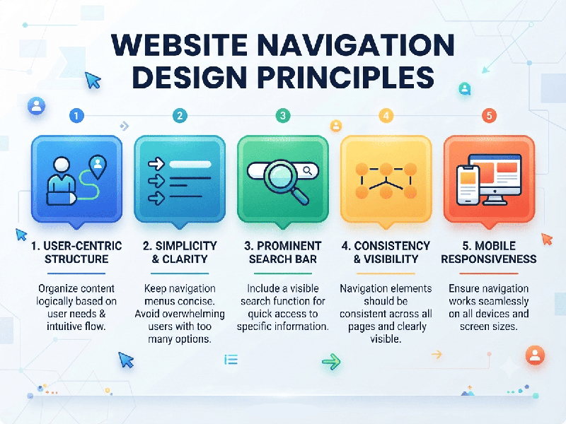
Website Navigation Design PrinciplesWebsite Navigation Design Principles
Designing intuitive website navigation is
essential for keeping visitors engaged, reducing bounce rates, and guiding them
smoothly toward conversion. Good navigation should be invisible—users shouldn't
have to think about how to find what they need.
1. Keep It Simple and Predictable
- Limit Top-Level Menu Items: Stick to 5 to 7 main items
in your primary navigation bar. Too many options cause cognitive overload
(Hick's Law).
- Follow Standard Conventions: Place your main menu
horizontally across the top header or in a standard hamburger menu on
mobile. Don't reinvent the wheel; users expect familiar patterns.
- Prioritize Based on User Intent: Place your most important and
high-traffic pages (e.g., Products, Services, Pricing, Contact) near the
left side of the menu, where users look first.
2. Implement Clear Visual Hierarchy
- Use Dropdowns Sparingly: If you use mega-menus or
dropdowns, ensure subcategories are logically grouped and easy to scan.
Avoid deep, multi-tier dropdowns that require precise mouse control.
- Distinguish CTAs Visually: Make your primary conversion
action (e.g., "Sign Up," "Get a Demo," "Book
Now") stand out from the rest of the navigation by using a
contrasting color or button style.
3. Maintain Consistency Across Pages
- Global Navigation: Keep the primary header and
footer navigation consistent on every single page of your website so users
never feel "lost" when clicking around.
- Predictable Logo Placement: Always place your company logo
in the top-left corner and link it directly to the homepage.
4. Provide Context and Orientation
- Breadcrumb Trails: Use breadcrumbs (e.g., Home
> Category > Subcategory > Product Name) on deep content or
e-commerce sites to show users their current location and allow easy
backtracking.
- Active States: Visually highlight the menu
item or tab of the page the user is currently viewing so they always know
where they are.
5. Optimize for Mobile and Touch
- Thumb-Friendly Design: Ensure links and buttons have
enough spacing (at least 48x48 pixels) to prevent accidental taps on
touchscreens.
- Responsive Collapsing: Use clean, accessible mobile
drawers or hamburger menus that load instantly and don't block core
content.