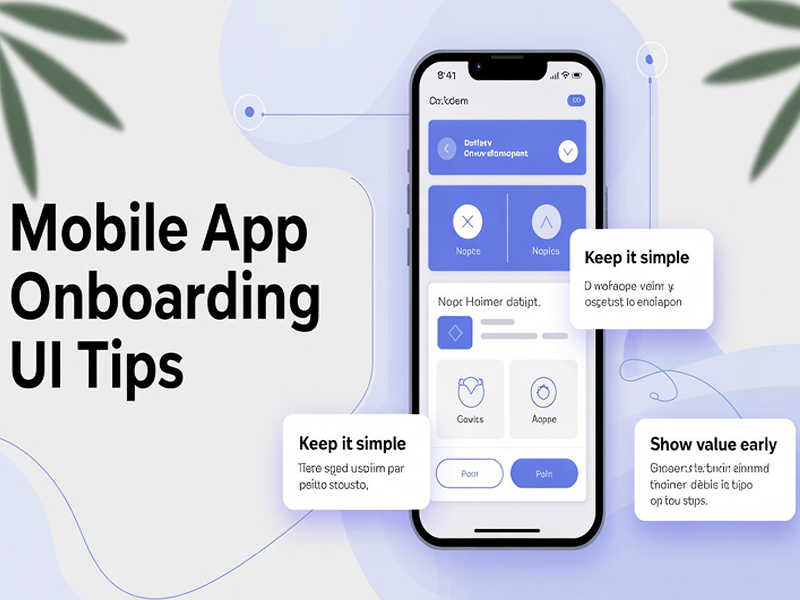
Mobile App Onboarding UI Tips
Mobile app
onboarding UI focuses on Time-to-Value (TTV), utilizing predictive
intelligence and minimalist structure to guide users to their first
"aha" moment within seconds. Effective onboarding is no longer just a
tutorial; it is a strategic entry point that can increase retention by up to
50%.
1.
Strategic Flow Patterns
- Progressive Disclosure: Do not overwhelm users
with every feature at once. Introduce advanced tools gradually as the user
interacts with the app to prevent cognitive overload.
- One-Decision-Per-Screen Model: Limit each screen to a
single primary action (e.g., "Add profile picture" or "Set
preferences") to maintain clarity and focus.
- Self-Select Personalization: Ask one or two essential
questions at the start (e.g., "What is your goal?") to tailor
the subsequent experience.
- Immediate Value (Quickstart): Allow users to explore or
complete a core task before requiring signup, as seen in
apps like Duolingo or DoorDash.
2.
Essential UI Components
- Actionable Checklists: Use gamified checklists
with progress bars to give users a sense of accomplishment and motivate
them to complete the setup.
- Contextual Tooltips &
Hotspots: Use
subtle, non-disruptive visual cues (like glowing dots) that trigger only
when a user reaches a relevant section.
- Skeleton Screens &
Predictive States: Instead of standard loading spinners, use skeleton layouts or
"preparing your data" animations to reduce perceived wait times.
- Micro-interactions: Incorporate small
animations for feedback, such as a confetti burst when a user completes
their profile, to provide emotional fulfillment.
3.
Friction-Reduction Tips
- Password-less Entry: Implement biometrics,
passkeys, or social logins (Apple, Google, Microsoft) to eliminate the
hurdle of creating new credentials.
- Smart Defaults & OCR: Use device data or optical
character recognition (OCR) for inputs (e.g., scanning a credit card
instead of typing numbers) to speed up forms.
- Visible Skip Option: Always include a clearly
visible "Skip" button for experienced or impatient users;
forcing them through a tutorial can lead to immediate churn.
- Just-in-Time Permissions: Only request system
permissions (camera, location, notifications) when they are contextually
necessary for a specific task.
4. Design
Visuals for 2026
- Legibility First: Use high-contrast
typography and ensure body text is at least 12 points for
readability without zooming.
- Thumb-Friendly Navigation: Keep primary CTA buttons
and navigation bars in the "natural reach zone" at the bottom of
the screen.
- Modern Styles: Use Glassmorphism
2.0 (frosted-glass transparency) and soft multi-tone gradients to
create depth and visual hierarchy without clutter.